The Bubble
Project Challenge
Brand Strategy
We partnered with The Bubble to define a clear brand mission, articulate core values, and establish a distinct brand voice that reflects their bold, retro personality and deep-rooted heritage. To ensure messaging stayed authentic and targeted, we also built audience personas to guide marketing language and help The Bubble speak to customers with confidence and consistency. From there, we advised them on social media and engagement strategies while consulting them on how to best implement and maintain their new brand identity.
- Begin with a brand discovery session.
- Continue with an all-day brand workshop.
- Create a brand identity and style guide.
Project Solution
Visual Identity
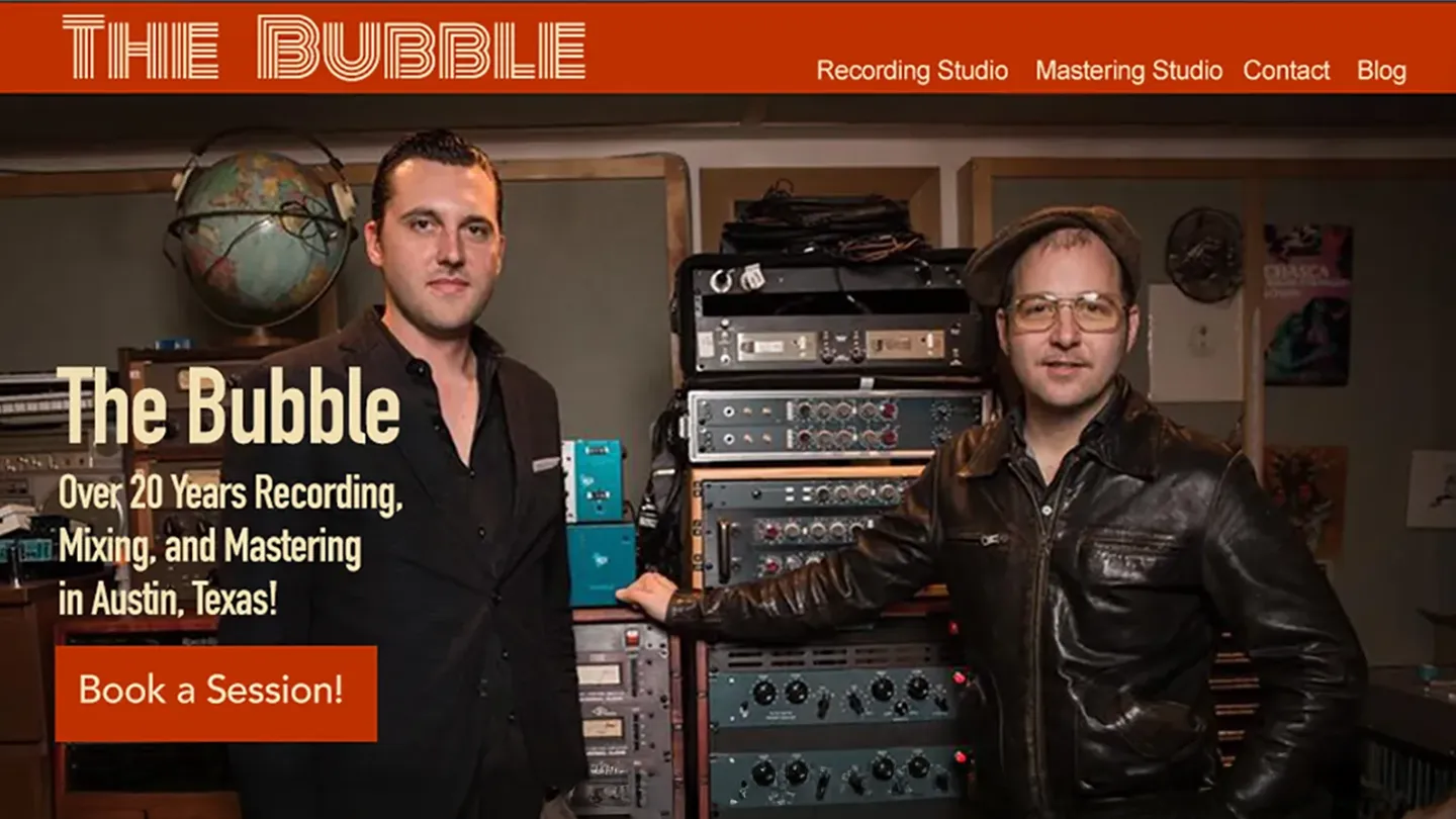
With the strategy in place, we translated The Bubble’s positioning into a cohesive visual system and documented it in comprehensive Brand and Visual Identity style guides. This included selecting typefaces and establishing clear typography rules, defining a color palette, and curating imagery and graphic elements that reflect the desired tone and personality. The result is a consistent, recognizable look and feel that can be applied confidently across every marketing touchpoint, ensuring the brand shows up the same way everywhere, from digital to print.
- The logo was created using the Monoton font for a bold, '70s retro style.
- DIN Condensed and Work Sans fonts evoke late '70s punk posters and '80s DIY 'zine attitudes.
- The color palette provides a foundation for the retro '70s vibe.
Project Results